As a Senior Data Analyst, I can say with certainty that pivot tables are one of Excel’s most powerful data analysis tools.
What Do Pivot Tables Do And What Are They Used For?
They allow you to summarize, analyze, and interpret large datasets quickly, to create custom dimensions (often referred to as calculated fields). They also allow for the creation of PivotCharts.
This guide will cover pivot tables from the basics to the most advanced functions, making it suitable for learners of all levels to learn this new skill set.
PRO TIP: Did you know? – the shortcut for pivot table is ALT + N + V
| Practice Excel Workbook | Download Here |
Creating Your First Pivot Table
Normally, we would need to prepare our data as it is essential to work with a clean, organized dataset (no merged cells, headers in place, no #N/A, #REF, or blank rows). For this exercise, the dataset provided is already cleansed, but if you wish for a challenge, see how to make your dataset dirty intentionally.
Where are Pivot Tables in Excel?
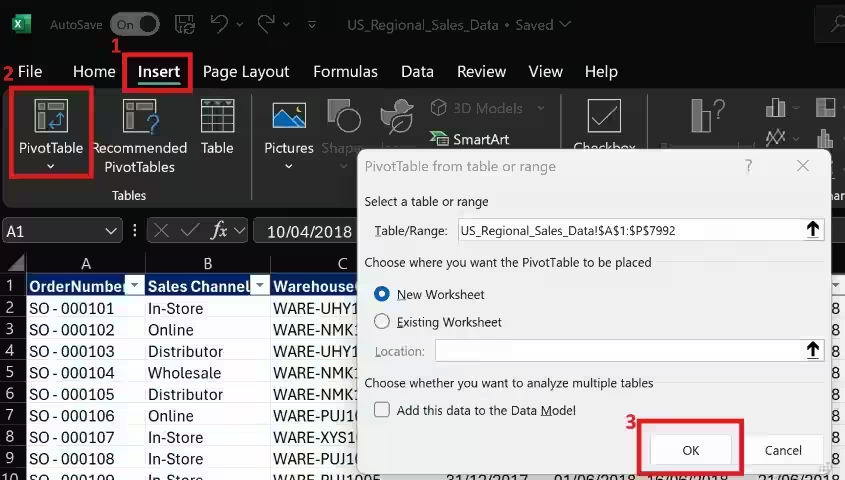
Once you have opened the file, in the ribbon head over to Insert -> PivotTable
- the range will automatically be selected for the table (as long as you have clicked a cell from its inside).
- New Worksheet will be selected by default, meaning the pivot will be created on a different tab. Click OK to have it created.
Understanding the Pivot Table Fields
Every time you create one, Excel will open a side panel named PivotTable Fields where you will be able to find the headers from the original table that the pivot was created from.
Under that, there will be 4 boxes that allow us to do our quick magic:
- Filters: applies filters that execute across the whole dataset
- Columns: expands the cell contents from the table on a column format
- Rows: expands the cell contents from the table on a row format
- Values: can be used for calculations and aggregations
You can drag fields from the above list into the designated boxes, try to replicate the below, and see for yourself how it works. The table will get populated with the fields you insert into these boxes.
Rows Field
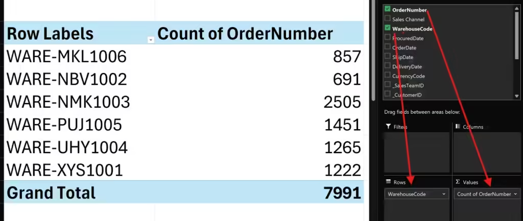
We now have just figured out, with only a few clicks, how many orders we have per warehouse, and we can determine which one is driving the most revenue.
If you look at the Values box, OrderNumber has transformed into Count of OrderNumber because the Values field allows us to create calculations and aggregations from our data. In this instance, we count the rows where the column WarehouseCode has a value on the same row as OrderNumber.
Columns Field
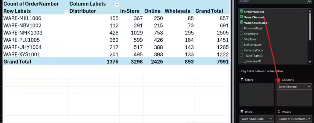
Drag the field Sales Channel to create a pivot breakdown of the sales. This will take a list of unique values from that column and place it as independent columns, creating a breakdown for the other data presented in the table, respecting the rules of columns and rows.
In this instance, we can quickly see that In-Store WARE-NMK1003 is a top performer. From quick analysis like this, we are able to gather insights and it gives us the opportunity to drill down into the data and find answers.
Filters Field
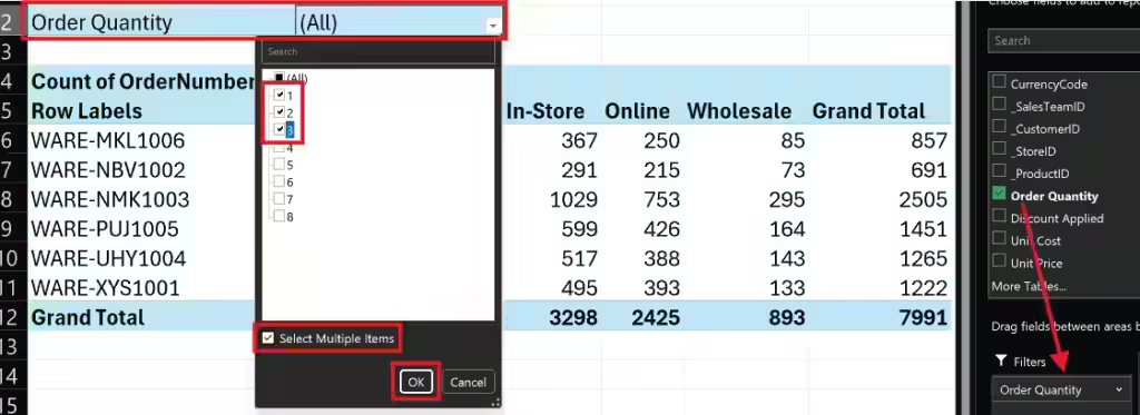
Drag the field Order Quantity into the Filters box. You will notice that 2 cells will get filled above our pivot table, this is how filters get populated and they act exactly as it sounds, they slice the data as per our needs.
Try and filter it so we only see orders with low amounts of items. From there, we can identify that across all warehouses, WARE-NBV1002 is the worst-performing even on small orders. This kind of insight allows us to research the reasons why and look for areas of improvement.
Values Field – Add Calculation to Pivot Table
Let’s start by removing the filters and values already applied by simply dragging them out of the boxes they’re contained in, into the spreadsheet. Drag the Unit Price field into the values box to allow us to analyze the income data.
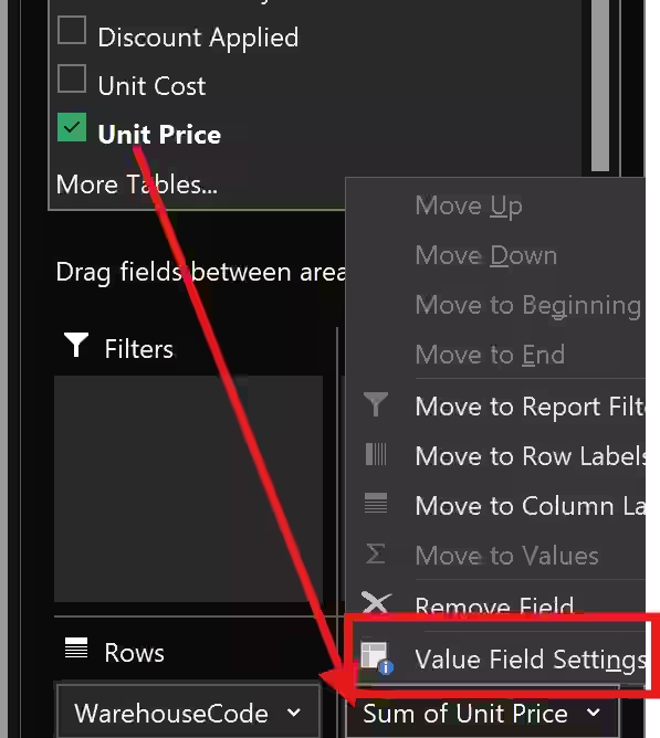
Notice the “Count” word before our field name has changed to “Sum“. Click on the dropdown next to Unit Price and then select Value Field Settings.
The Value Field Settings will open a panel where you can choose the kind of calculation that you want to use to summarise your data from the selected field, in our instance Sum as we want to know the total of sales. Depending on how you want to summarise your data, you can change it to Count, Average, Min, Max, Product, etc.
By clicking on Number Format, we can format our fields as Currency.

What if we wanted to add a calculated field in Pivot Table that tells us how much a warehouse represents from all sales?
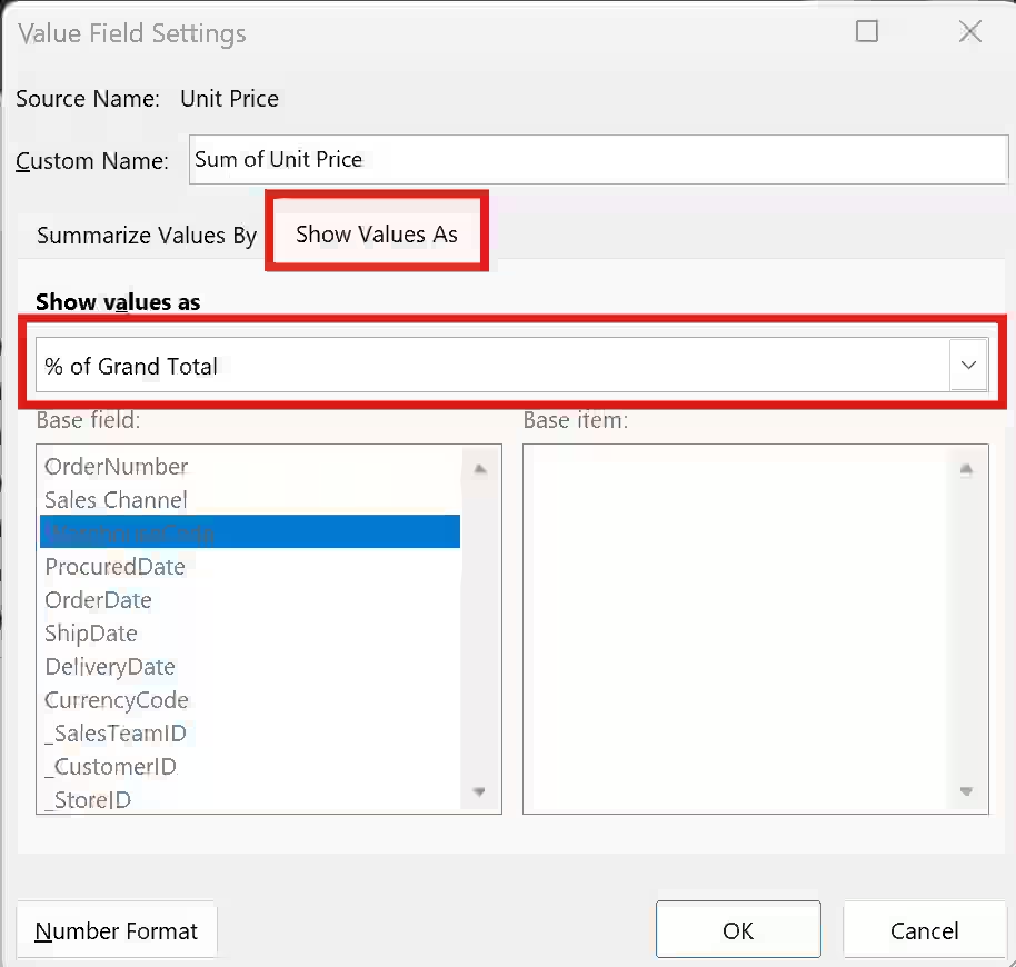
In the same Value Field Settings, on the tab “Show Values As” we can select the type of calculation to execute on our tabular data. By selecting “% of Grand Total” we can gather that WARE-NBV1002 only represents 8.46% of our total sales, with the lowest wholesale amongst all warehouses.
Count Distinct Excel Pivot Table
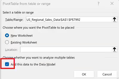
Because Excel is not yet able to support distinct counts, we need a workaround this. When inserting a Pivot Table, make sure to add the data to the Data Model.
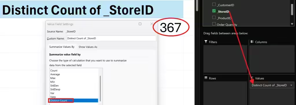
Then, simply drag the field you want to count distinct values from, then on the dropdown (as shown in a few screenshots up) go to Value Field Settings and select Distinct Count from the list. we now know that we have 367 unique stores in our sales dataset.
Sure, you could have done a quick formula in Excel ( =COUNTA(UNIQUE(range:range)) ), but this is more fun, isn’t it?
Add a Calculated Field To a Pivot Table
If you’re a PowerBI fan, I’m sure you’ll love the versatility of this Pivot Table functionality! We can create calculated fields based on our data to provide insights for our analysis.
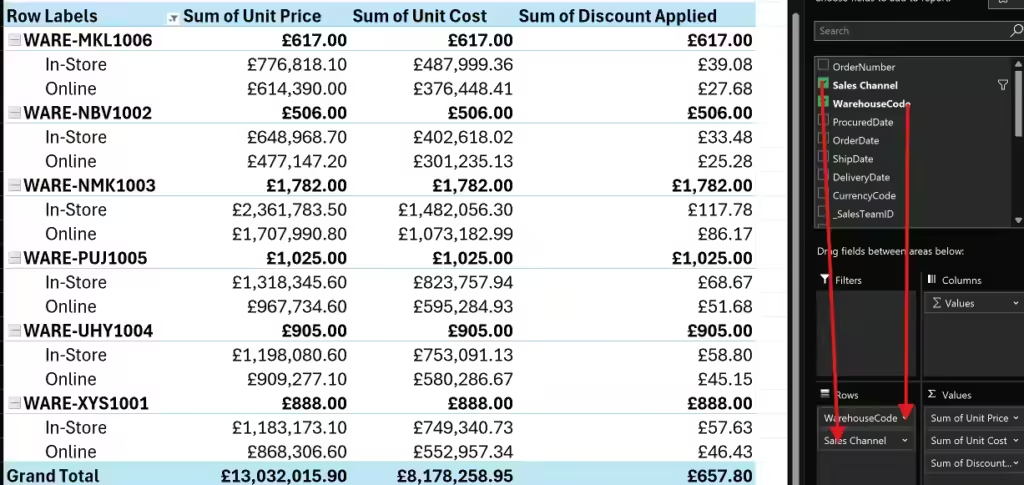
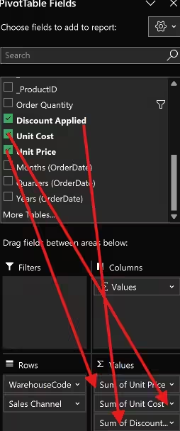
Let’s try it! Drag the fields as in the screenshot above (filter for only Online and In-Store). Also, remember the formatting rules applied a few steps ago, then in the ribbon head over PivotTable Analyze, under Calculations Group, select Fields, Items, & Sets -> Calculated Field.

For this exercise, we want to determine the profit for In-Store and Online sales for all warehouses.
Clicking on Calculated Field will open a panel that allows us to develop our formula for the new column. Similar to an Excel column, we use fields (headers) to make calculations.
By using the Insert Field or double-click, we can insert fields into the formula bar, followed by the “–” sign and then other required fields. Don’t forget to give your dimension a name!
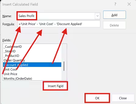
This will create a PivotTable Field and you can use it for other formulas too, making it very versatile.
PRO TIP: Did you know? – you can change the solver order for multiple calculated fields!
